 Guide
GuideWhat a template is
One Figma page. Every top-level frame on it becomes one page of the finished guideline.
Number your frames and the numbers decide the order — 01, 1. Cover and Page 2 are all read the same way, and the first number anywhere in the name is the one that counts. Number every frame or none of them; a half-numbered page is ordered by position instead, and says so in a warning.
With no numbers, frames are read the way you would read them: in rows, top to bottom, and left to right within each row. The generated guideline is also laid out the way your template is — author it as a grid and it comes out as that grid, rather than as one very long line.
When you read that page in, the plugin does not copy your design — it records it. Fills bound to colour variables become roles. Text using text styles becomes type roles. Layers whose names are tags become slots. Everything else is kept exactly as you drew it, and appears in every guideline unchanged.
That split is the whole idea: a heading that reads “Primary Palette” stays those two words forever, while the swatch beside it becomes whatever colour the client supplied.
Three rules
Nearly every template that comes out wrong breaks one of these. They are worth doing before you draw anything.
- Bind every fill to a colour variable. A literal hex is recorded literally, and the client’s colours have nothing to replace.
- Apply a text style to every text layer. Unstyled text keeps the font you drew it in, so the client’s typeface never reaches it.
- Make every page frame the same size. The blueprint records one page size, taken from the first frame.
1. Colour variables
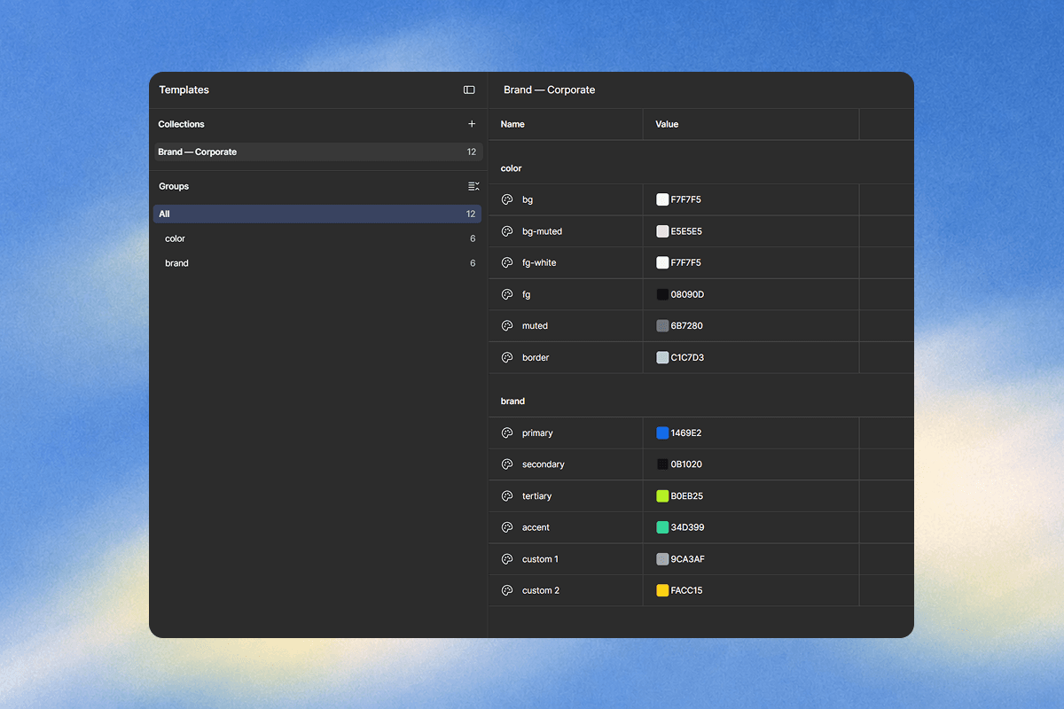
Two groups, and the prefix is what separates them. The plugin’s Colours step is built from whatever it finds, headed by group — add a third group and a third heading appears, with no change to anything else.
| Group | What it is |
|---|---|
color/… | The semantic roles your pages actually paint with — bg, bg-muted, fg, fg-white, muted, border. |
brand/… | The client’s own palette — primary, secondary, tertiary, accent, and however many extras you want to offer. |
Name them for what they are, not for what they look like: brand/primary, not brand/blue. Twelve variables is a comfortable template. Every one you add is another field the client has to fill in before they can generate anything.
2. Text styles
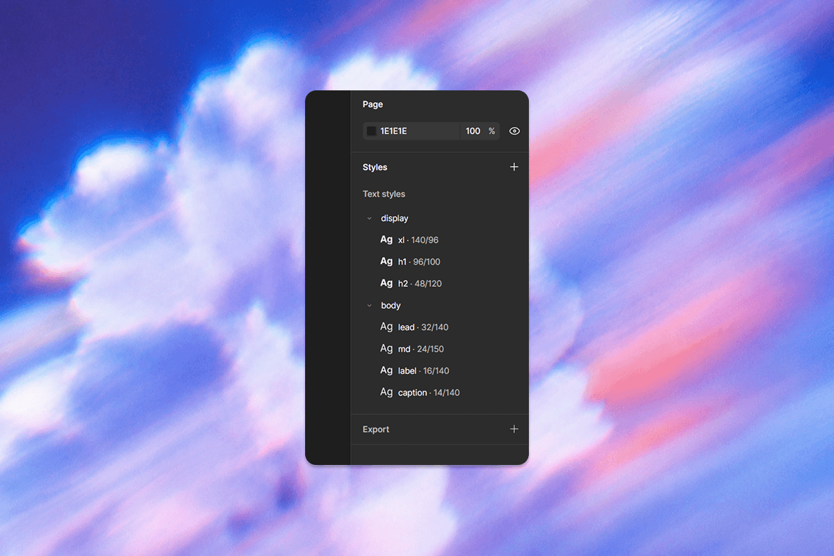
Clients supply two typefaces. Which one a piece of text gets is decided by the group its style is in:
| Style name | Typeface used |
|---|---|
display/h1 | The client’s display face |
body/md | The client’s body face |
caption | No group, so the body face |
Only the family is swapped. The size, weight, line height and letter spacing you set stay yours in every generated guideline — which is what keeps a template recognisably your design rather than a layout that happens to hold a logo.
3. Naming layers
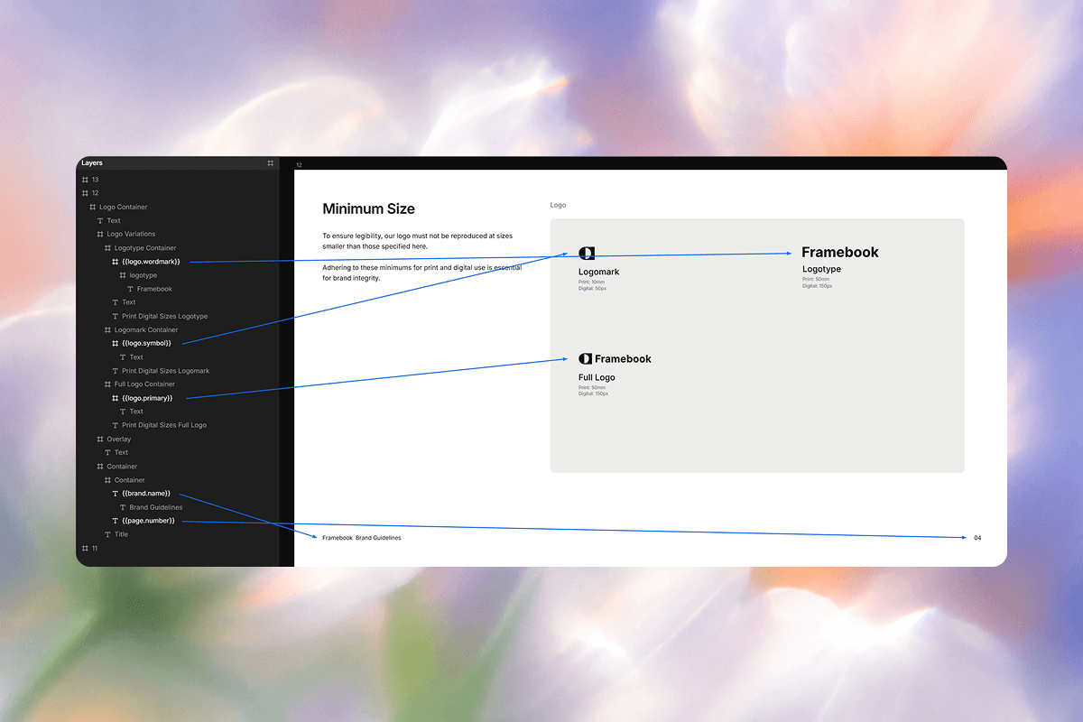
A layer named {{something}} is a slot. A layer with an ordinary name is left exactly as it is. That is the entire mechanism.
Text bindings also work inside copy, not only as a layer name — so a paragraph can read “Our brand typeface is {{display.font.name}}.” and come out as a sentence.
A binding that finds nothing renders as empty and reports a warning. If a value is genuinely optional, give it a fallback: {{tagline || 'Your tagline here'}}.
4. Reading it in
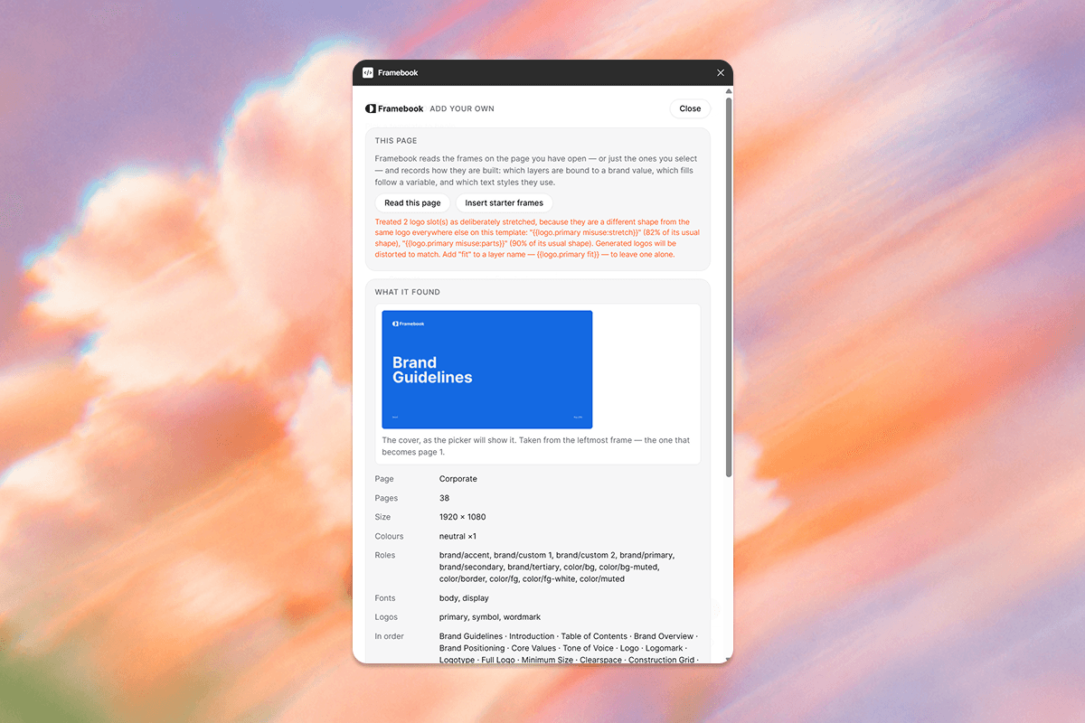
Open the plugin on the page you want to read. On the Template tab choose Add your own, then Read this page, give it a name, and Save template.
Read the warnings on that screen before you save. They are the difference between a template that works for one brand and one that works for every brand — an unstyled text layer or an unbound fill is reported by name, with the fix.
Change the design later and nothing moves until you read the page again. Every generated guideline is built from the blueprint saved at that moment.
Reference
Text
| Write | Get |
|---|---|
{{brand.name}} | The brand name |
{{tagline}} | The tagline, which may be empty |
{{page.number}} | This page’s number, from 1 |
{{page.total}} | How many pages the template has |
{{display.font.name}} | The display typeface’s family — .style gives the weight |
{{body.font.name}} | The body typeface’s family |
Colour values
For the page that prints a swatch and its numbers underneath. The values are read from the colour actually painted, so the two can never disagree.
| Write | Get |
|---|---|
{{primary.hex}} | #1469E2 |
{{primary.rgb}} | 20,105,226 |
{{primary.cmyk}} | 91,54,0,11 — .cymk works too |
A colour answers to four names, so you can label the layer after the colour rather than after the variable path:
| For color/bg-muted, all of these | Kind of name |
|---|---|
{{color/bg-muted.hex}} | The full role — always works |
{{bg-muted.hex}} | Last segment |
{{bgmuted.hex}} | Punctuation dropped |
{{backgroundmuted.hex}} | bg and fg spelled out |
If two colours would answer to the same short name, neither does — you get a warning instead of a plausible wrong hex printed under a swatch. Use the full role to disambiguate.
Logo slots
Any layer — a frame, a group, a shape — named {{logo.<variant>}} is replaced by the client’s logo, fitted inside the layer’s bounds. Draw your own mark inside it as a placeholder; its children are never exported.
| Variant | Notes |
|---|---|
primary | The full lockup |
wordmark | Type only |
symbol | The mark alone |
horizontal, stacked | Accepted, but clients only upload the three above — these render the primary lockup and warn. |
The colour of your placeholder is an instruction. Draw it in one colour — ideally bound to a variable — and every client’s logo is recoloured to match on that page. Draw it in two and the plugin leaves their own colours alone, because guessing which of two colours to flatten a stranger’s logo to is not a guess worth making.
Logo modifiers
Added after the variant, separated by spaces.
| Modifier | Effect |
|---|---|
fill | Stretch the logo to the slot instead of fitting inside it. |
fit | Never distort this slot, even if its shape suggests it was drawn stretched. |
misuse:<kind> | Demonstrate a misuse on it — see below. |
Misuse recipes
For the “do not do this” page. Write {{logo.primary misuse:shadow}} and the misuse is performed on whatever logo arrives — the wrongness belongs to the demonstration, not to the brand, so it cannot be drawn into a placeholder and copied.
| Kind | Shows |
|---|---|
stretch squash | Distorted proportions |
rotate | Turned off its baseline |
shadow blur fade | Effects applied to the mark |
recolor | The whole mark in an off-brand colour |
recolor-part | One letterform recoloured — needs a logo of more than one path |
stroke outline | An edge on the letterforms; outline also hollows them out |
parts | One component resized — needs a logo of more than one path |
Every recipe is a guarantee, not an override. If your placeholder already carries the effect — you really did rotate it — your value is kept and the recipe does nothing. Declaring a misuse can never fight your design.
Diagrams
| Write on a frame | Draws |
|---|---|
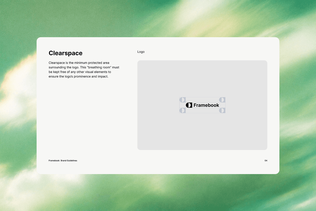
{{clearspace.primary}} | The protected area: the logo, a clear zone one unit around it, corner marks and rules. unit:0.5 to 4 changes the margin. |
{{construction.symbol}} | A modular grid, bounding box, centre axes and rules at the mark’s own edges. div:2 to 24 sets how many squares tall it stands. |
Pages that draw themselves
Three pages in a guideline cannot be laid out in advance: clearspace, construction grid and logo misuse. Every measurement on them is a function of the client’s logo — its width, its height, how many paths it has — and a lockup’s proportions are the thing that varies most between brands. Place those marks by hand and you place them correctly for exactly one logo: your own.
So you name the frame and the plugin draws the geometry. It still takes its styling from what you drew inside: the stage fill, the corner radius, the guide stroke and its dash, and the two logo colours. Yours is the look; theirs is the arithmetic.
What the warnings mean
The plugin never drops a layer it does not understand in silence. These are the ones worth acting on.
| Warning | What to do |
|---|---|
| has no text style | Apply one. The text will render, but the client’s typeface cannot replace a literal font. |
| No layer on this page binds a colour variable | Bind your fills. Without this the client’s colours have nothing to replace and every guideline comes out in yours. |
| holds a placeholder in N colours | Expected if the mark is genuinely multi-coloured. Draw it in one colour if you want logos recoloured to match the page. |
| looks like a page number but is plain text | Rename the layer to {{page.number}}, or every page prints the same number. |
| has no visible stroke | A line with no stroke renders invisible. Give it a colour, ideally a variable. |
| has neither a fill nor a stroke | The shape would render invisible. Give it one; a stroke alone is fine. |
| has no outline the exporter can read | The shape is empty or fully masked, so there is nothing to draw. |
| which the exporter cannot capture | That layer type will be missing from every guideline. Frames, groups, text, rectangles, lines and any drawn shape — pen paths, stars, ellipses, boolean operations, artwork pasted in from Illustrator — are all captured. Sticky notes, connectors, slices and widgets are not. |
| Treated N logo slot(s) as deliberately stretched | Correct on a misuse page. Anywhere else, add fit to the layer name. |
The first three pages of an official template are its free preview — anyone can generate them without a subscription. Keep that in mind when you decide what page 1 to 3 are.
